

Graphic: Elena Scotti/GMG
“We’ve got some books here I want to show you,” Johnny Carson told a Tonight Show audience in March 1990. He turned to a colorful stack of paperback romance novels.
He explained that you usually find these books in supermarkets; “They say the biggest type of reader of these type of things are ladies,” he informed his viewers and sidekick Ed McMahon. Carson began to hold them up, one by one: “You see that?” The camera cut in close to show The Lion’s Lady by Julie Garwood, featuring a blonde with her head thrown back as a dark, handsome man nuzzles her neck. Then came Elaine Coffman’s Escape Not My Love, which he opened to what’s known as the “step-back,” a glossy, lush, full-color interior cover featuring a couple locked in a passionate embrace. Here, it’s a dark-haired woman swathed in a generically 19th-century lavender gown erupting with frothy lace, being nuzzled by a blonde Adonis, the pair horizontal on a pink satin surface, an enormous floral arrangement behind them.
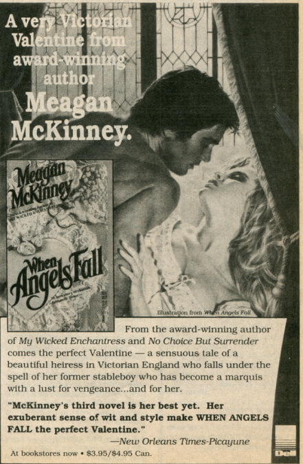
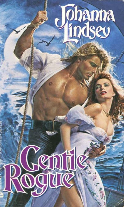
“See, this gives you an idea of what it’s like,” said Carson. “Now you’re talking!” replied McMahon. “The guys are always bare-chested and so forth,” said Carson, proceeding to Megan McKinney’s When Angels Fall with a couple tumbling across a bed—she’s about to burst out of a chemise, he’s wearing tan pants that show off his butt, there’s another vase full of roses nearby—pronouncing it “steamy stuff, folks.” Finally came the grand finale: Savage Thunder by Johanna Lindsey, then one of the genre’s most popular authors. “You know any of these people?” he asked McMahon, who replied that he did not.
“Look at the cover on this baby,” Carson said, flipped the book outward to outright hooting and hollering from the audience. The cover featured a bare-chested young model named Fabio, hair blowing in the breeze, a redhead en borderline déshabillé at his feet and clinging, beseeching, to his open leather vest. Carson didn’t read any of the back-cover copy, or flip through to any of the quotes—the covers said it all.
In a way, Carson and McMahon were right: The covers did quite deliberately indicate that there was steamy stuff inside. No popular genre is as firmly associated with its packaging as romance novels; even Playboy is given constant credit for its best journalistic years. For decades, coverage erased any differences between covers and content, and the genre has long been synonymous with a specific style of art from a specific period.
As the 1970s opened, the look of romances was tame, reflecting the fairly chaste contents of the books themselves. Sex scenes were closed door, or at least incredibly light on detail; any jollies to be gotten came in the form of the infamous “punishing” kisses.
Speaking to Publisher’s Weekly in 1974, Bantam art director Len Leone described his approach like so: “I try to make my romances look like little white candy boxes,” he told the trade publication. “Flowers on the cover, a piece of sweet but simple art in a pretty shape on the box.” The market at the time was dominated by short, contemporary-set stories and practically synonymous with the publisher Harlequin. Their style tended to be pulpy depictions of men and women staring moodily into the distance, perhaps with some Alps behind them. Generally, these storylines featured naive young girls paired with inscrutable older men who didn’t reveal their emotional cards until a declaration in the last pages.
But the actual storylines of the books underwent a sea change after the publication of The Flame and the Flower by Kathleen Woodiwiss in 1972 and Sweet Savage Love by Rosemary Rogers in 1974. Rogers’s and Woodiwiss’s success proved that women would buy sweeping epics featuring explicit, often violent sex. These new storylines required new packaging, and the covers began to dramatically change.
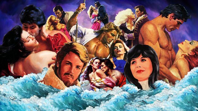
You can see it in the progression of the covers from the publisher Avon. Both The Flame and the Flower and Sweet Savage Love featured their starring couples on the cover, but in the form of small cameo images. Through the mid-1970s, they became bigger, and bigger, taking over entirely by the 1977 arrival of Woodiwiss’s third book, Shanna, the cover of which was occupied by a couple in torrid embrace surrounded by lush greenery and in the foreground giant, frilly, pink orchids.
A distinctive visual style quickly emerged, and there’s some debate over who deserves the credit. In Publishing Romance, John Markert credits Playboy Press for ratcheting up the sex factor, when editorial director Mary Ann Stuart decided they ought to try competing with Avon. They had neither brand-name authors nor the marketing budget to anoint new ones through advertising alone, so they telegraphed their offerings through bold, bosomy covers. But the industry tends to credit the longtime art director at Avon, Barbara Bertoli—whose style a 1981 issue of Publisher’s Weekly described as “a swirling, Baroque melange of curving, hand-lettered titles and red-violet background covers against which lusty heroes seduce swooning, long-haired heroines to produce what one editor calls ‘The Berniniesque St. Teresa in Ekstasis Look.’” (The 1983 cover of Woodiwiss’s A Rose in Winter is a particularly good illustration of what they meant.)
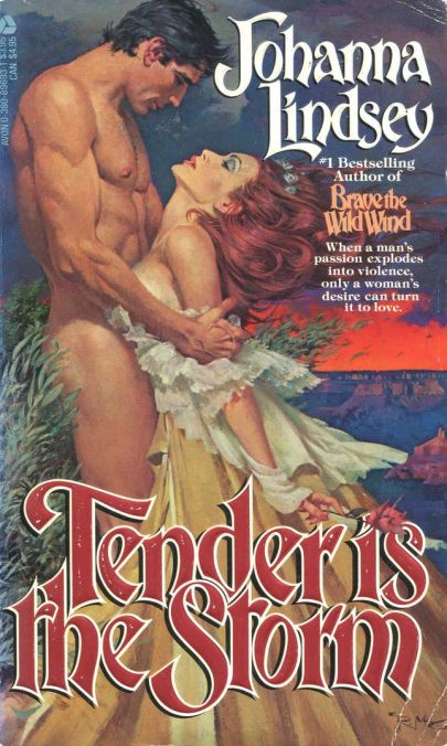
The “clinch” became the standard and remained so throughout the 1980s—the industry term for those covers featuring the protagonists locked in a passionate embrace, their clothes frequently on the verge of melting away, seemingly caught in flagrante delicto. It might be more or less torrid. For instance, writer Johanna Lindsey had a string of truly outrageous covers that peaked with 1985’s Tender Is the Storm; illustrated by Robert McGinnis, it features a frankly shocking amount of naked, manly haunch and appears to depict a man outright thrusting his penis between a woman’s abundant breasts. Carson probably couldn’t have shown it without FCC complaints. In the book The Romance Revolution, Carol Thurston suggests that in at least one city, Minneapolis, romance novels got caught up in the anti-pornography ordinances that tore the feminist movement apart in the mid-1980s—specifically, the ones with “lurid” covers. (This is ironic, as Thurston points out since at the time the most sweet-seeming Harlequins were frankly more retrograde.)
Frequently subtler and perhaps even more iconic, though, was the work of artist Elaine Duillo. She wasn’t quite so out-and-out, as People magazine reported in a brief visit to her Long Island studio in 1989: “The sword on the ground is a symbol for his manhood,” she said, indicating a recently finished work. “Everything is subliminal.” Not entirely, though: Kmart declined to carry Bertrice Small’s A Love for All Time, thanks to the cover, which was raunchier than she intended it to be—both hero and heroine are fully clothed, him clutching her shoulders, but she’s holding her hand to her breast and it looks like she’s pinching her nipple. “It did exceptionally well,” Duillo noted.
Duillo’s covers are perhaps the most stunning incarnation of the stereotype, featuring heroes who are a distinctly ’80s style of high glam, with great masses of hair and blue eyeshadow and vivid dresses that are always falling off their shoulders. They’re so evocative they practically smell like hairspray and heavy perfume. The models were always white, even when a protagonist was supposedly Native American—a popular trope that produced some truly appalling depictions. This was the standard across artists and lines in the decade. Publishers would try to one-up each other, producing covers that were more visually hectic. Take, for example, the publisher Zebra’s proud addition of a holographic sticker and a richly saturated, almost hectic color palette dominated by hot pinks, vivid oranges, searing greens—like glamour shots as interpreted by Hunter S. Thompson.
There was tension within the industry over these covers. Many of the writers were embarrassed by them and thought they lent credence to the charge that romance was nothing but soft porn for housewives. One school of thought held that the explicit covers were in fact designed to appeal to men—specifically, middlemen, the wholesalers who stood between the largely female editorial departments at publishers and the largely female readers. They picked what they liked, and presumably what they liked was tits.
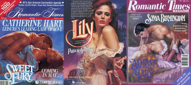
But the idea these covers were wholly for men is contradicted by the loud enthusiasm of an organized group of fans. Romantic Times was the preeminent publication for romance fans until the emergence of online communities; without any sort of coverage in mainstream book reviews, publishers all bought advertising space and writers gave interviews and participated in their rowdy fan conventions. By the late 1980s, essentially every cover of the magazine featured a clinch from an upcoming book. Owner Kathryn Falk went all-in on covers, cover models, and made Fabio into a niche celebrity.
It was artist Elaine Duillo who first “discovered” Fabio. Duillo painted from photographs—she worked through Robert Osonitsch Studios, a sort of one-stop shop popular with cover artists. Osonitsch supplied costumes and props and kept a stable of potential models, and Duillo painted the photographs with a winking precision; in a 1989 People profile, she showed the magazine one series where the male model had gotten an erection—which she duly included in the final painting. It was Osonitsch’s wife, Arlene, who kept track of headshots and showed Fabio’s to Duillo one day, sometime in the mid-1980s, saying Bob didn’t even want it. “I looked at the photo and said this guy could really get the women started,” Duillo told Illustration magazine in a 2012 interview. She first put Fabio on a back cover—because Bertrice Small, the author, didn’t want him on the front. When that book did well, she promoted him to the front for the cover of Lindsey’s 1987 Viking saga Hearts Aflame. He was quickly anointed as the ultimate cover man.
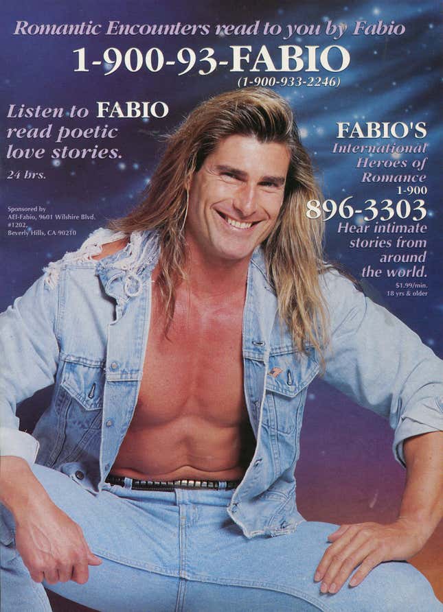
But Falk deserves a lot of the credit for helping launch him as a worldwide icon, putting him in Romantic Times constantly and having him appear at their events. From there, he jumped to the National Enquirer—“Win a Dream Date with the Sexiest Man in the World”—USA Today, Cosmopolitan. He had a fan club, launched a 1-900 number that promised “Romantic encounters read to you by Fabio”—advertised with a full-color poster in Romantic Times, of course—and released an album of love songs and a direct-to-video compilation of romantic short movies that are truly terrible. The tone of the fandom suggests a certain camp factor to Fabio’s fame; there’s a giggly giddiness to it all.
It’s easy to roll eyes at Fabio, with his expansive, conspicuously hairless chest and his beautiful hair. He sometimes seems more like a simulacrum of masculinity more than real human man. He played into the most cliched stereotypes of gender norms, parlaying his celebrity into regular appearances on talk shows to trot out pat wisdom about how women just want romance and men just want adventure. His appeal has soured dramatically in recent years: He’s now a Trump supporter and has appeared on Tucker Carlson complaining about how liberals ruined California.
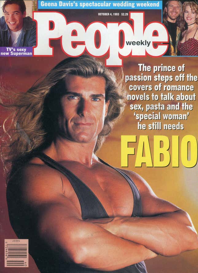
But surveying the media coverage from his heyday, his attraction seems obvious. “The media loves him, because he’s handsome, intelligent, and nice,” Sally Jessy Raphael told People when he appeared on the cover in 1993. “His je ne sais quoi attracts women; he’s one of the few men I’ve never sued,” Gloria Allred said. In a February 1994 appearance on Joan Rivers’s QVC show, Can We Shop? he promoted a VHS tape of original short romances ($15.50 plus $3.72 shipping and handling), as well as an exclusive, “Fabio’s Nighttime Set T-Shirt and Pillow” ($29.95 plus $4.22 shipping and handling). Rivers spends the whole segment reveling in the camp factor: “You can lie on Fabio, have Fabio on top of you, and watch Fabio! It can’t get better than that!”
She is also, transparently, having a great time: “I just love you. Come back and visit again. You’re the best,” Rivers tells him. (He had appeared on her short-lived talk show four times.) At the end, she asks him his ultimate fantasy. Fabio smiles and replies, with seeming utter sincerity: “To be on a deserted island with you, Joan.” She laughs, delighted, knowing it’s clearly bullshit but loves every minute.
Straight men weren’t so taken with him. Esquire included him in their 1993 Dubious Achievement Awards. Compare his rapport with Rivers to this 1993 appearance in absentia on David Letterman, in which actress Bonnie Hunt told a story about her mom meeting Fabio on a plane. It’s a deeply loving story, but the punchline is absolutely Letterman showing off a picture of her middle-aged mother and the exaggeratedly studly Fabio. Letterman does not seem particularly charmed by the notion of Fabio.
As a sheer matter of numbers, Fabio was never the best example of a romance novel hero. His celebrity has long elided attempts to push back on the overwhelming whiteness of the genre, like the romances of Beverly Jenkins, drawing on African American history. The Fabio phenomenon also wholly ignores the 1980s boom in short contemporary-set category romances sold by Harlequin and its competitors, which pushed the envelope in modernizing the genre. Storylines were sexed-up; heroines had careers; the books often tackled social issues—one Dell Ecstasy, Gentle Protector, had a storyline involving the still new concept of “date rape.”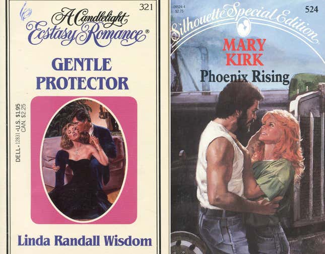
The hero of these books was much more likely to resemble Tom Selleck in his Magnum P.I. glory days—all mustaches and chest hair. These, too, featured swoony clinch covers—Loveswept’s earliest books literalized the wave metaphor through graphic design, framing every illustration in a giant wave—but they never seemed to catch the attention of the wider world the way Fabio and the historicals did. In part, that’s because the covers of the historicals were perhaps the most successful at their most basic job: grabbing the eye in the jostling environment of a B. Dalton or a supermarket and making a promise about the excitement level and escapism of what was inside. As Duillo put it: “The book buyers, women with a stroller with a kid and another kid that’s going out of her sight, they have to pick a book quickly…. they’re going to pick up the book with the cover image they like and they can see immediately.”
But there was also the undeniable fact that Fabio’s appeal was easier to shrug off with a laugh, thanks to his pretty face and his long, beautiful hair and his European accent.
Hence Fabio has come to dominate the narrative of the genre in the popular imagination, swallowing up the stories of the women who actually made him famous. For instance, Duillo, despite a long and successful career that earned her a place in the Society of Illustrators’ Hall of Fame, has been rendered a footnote to the story of Fabio. “I became known as ‘the Fabio artist’—and I’m not—I’m an artist, not ‘the Fabio artist,” she told Illustration magazine in 2012. It’s true of the entire genre. People who’ve never heard of Johanna Lindsey, or Kathleen Woodiwiss, or Barbara Bertoli, know Fabio’s name. What’s more, he was used to make their entire industry a big fat joke about horny women.
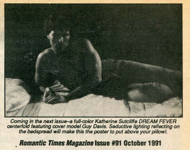
Clinch covers are, in their way, the counterparts of pinups and cheesecake garage calendars. Romantic Times frequently turned them into literal pinup posters that could be pulled out of the magazine and hung on the wall. “Seductive lighting reflecting on the bedspread will make this the poster to put above your pillow!” one issue teased an upcoming centerfold. Duillo, too, promoting a line of posters she began selling, once told RT that, “Several readers claimed they hang them over their bed!” Even as the 1990s wore on and the imagery mellowed, taking on pastel hues and suggesting more swooning than outright ecstasy, they were still consciously evoking a style associated with sex: The online gallery of artist Max Ginsburg explains that covers he did for Julia Quinn and Lisa Kleypas during the decade are explicit references to the raunchy Rococo works of Jean-Honoré Fragonard and François Boucher.
Romance covers are incarnations of fantasy and desire and sexual want, sold to an audience that was generally female, often older, and often middle and working class. Ladies in supermarkets, as Carson suggested. Moms. They reflect books that are deeply interested in sex. Their romantic plots frequently involve women getting off as an essential element of their happily ever after. There has always been a deep, cheerful bawdiness—sometimes veering into outright lasciviousness—in the romance fandom and in the playful but genuine enthusiasm for Fabio. It asks no permission from Johnny Carson and Ed McMahon, and does not take their wants into account.
It doesn’t think of them at all.