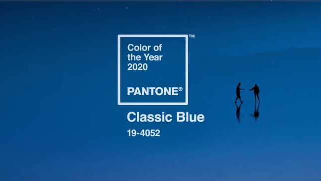
Pantone's Color of the Year for 2020 Is Boring as Hell!
Latest

Every year, Pantone picks a color the company believes will become unavoidable everywhere the following year. In 2019, they suggested coral would make its way into popular culture (I’m not so sure it did), and in 2018, everything was ultra violet (It absolutely was.) So what shade awaits us in the new decade, beginning with 2020? “Classic Blue,” not to be mistaken with Cerulean (Pantone’s Color of the Year 2000), Aqua Sky (their 2003 pick), Blue Turquoise (2005), Blue Iris (2008) and Serenity (2016). According to their website, “Classic Blue” is “a timeless and enduring blue hue” meant to “highlight our desire for a dependable and stable foundation on which to build as we cross the threshold into a new era.” That seems vaguely political for Pantone, but go off. “Classic Blue” is also meant to inspire “a sense of peace and tranquility to the human spirit, offering refuge,” fostering “resilience.” That’s all well and good, but must it be such a boring color?
When I see blue, I think of consumerism—colors effect behaviors, like how the red and yellow of McDonalds makes us hungry. Blue, historically, boosts sales. It makes us want to buy. Blowing money on useless crap doesn’t instill “peace and tranquility of the human spirit,” within me, but I digress. If I’m being a gender essentialist here, maybe classic blue is for boys—signaling a year soon to be bombarded with think pieces about nuanced, and soft, expressions of masculinity. GQ just dedicated their November issue to this very subject. If I’m thinking politically, maybe a blue color alludes to a Democratic victory. In that case, forget anything negative expressed here. Go blue!
However, here are some other colors I think may be more fitting, just ‘cause:
- Ochre, or Mustard: This heinous shade was everywhere, might as well have it define our future
- Flame Scarlet: I saw it listed in Pantone’s Spring/Summer 2020 NYFW Color Palette, and I love it.
- Biscay Green: It’s like mint green, but with your pinkies up.
- Poop Brown: Because the world is in the shitter.
Happy new year, everyone!